


Agentic Chart Extraction
Unlocking Visual Data: Introducing Agentic Chart Extraction
At Tensorlake, we're excited to announce a powerful new capability in our document parsing pipeline: Agentic Chart Extraction.
Agentic Chart Extraction uses an agentic approach to transform static images into dynamic, usable data, unlocking a new layer of value from your documents. Whether you are processing financial reports, scientific papers, or business presentations, you can now access the data behind the visuals.
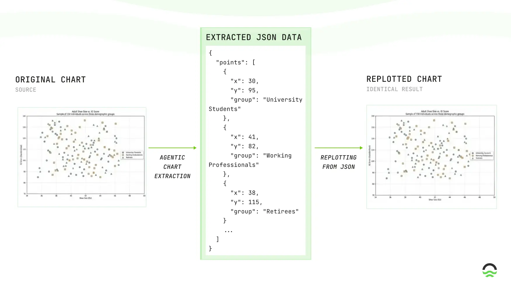
In the example below, on the left side we find a scatter plot with a larger of points and to the right, the plotting of this data after being processed by our Agentic Chart Extraction. This is challenging since there is a large number of uncorrelated points. We show that our system can generate a structured output that matches the original chart and that we can use this output to replot the chart.
Key Capabilities
- Chart type detection: High accuracy across common chart types (line, bar, scatter, pie).
- Data series extraction: Returns structured series (category/value pairs, coordinates where available) ready for plotting or analytics.
- Robustness: Handles multi-series charts, varying axis scales, and dense point clouds; retains good fidelity even on 50+ point series.
- Deliverables: JSON outputs per-chart, evaluation reports, and plottable visualizations.
Supported Output Schemas
- We support four standardized JSON schemas used for extraction:
- Pie chart: slice-centric schema with
label,valueand optionalpercentage,colors, and display flags (good for donut/pie summarization use-cases). - Bar chart: supports
vertical/horizontal, namedseriesfor grouped/stacked bars,x_axis.categories, optional axis bounds/formatting, and per-bar display flags — ideal for categorical comparisons and time-binned revenue/metrics. - Line chart: x/y axis definitions, explicit
valuesfor x-axis (numeric or categorical), multipleserieswith styling (color,line_style,marker), and plotting hints (legend_position,grid) — suited for trends and dense time-series. - Scatter plot: per-series
x_data/y_dataarrays, marker styling (size,alpha,edge_color) and axis bounds — used for point-wise analyses and correlation extraction.
- Pie chart: slice-centric schema with
Schema-Driven Outputs — Directly Plottable
- All extracted predictions conform to the predefined JSON schemas (pie/bar/line/scatter). That means:
- Consistent ingestion: you can build a single parser that consumes every chart JSON produced by our system — no per-chart ad-hoc parsing required.
- Direct re-plotting: each JSON contains numeric arrays plus rendering hints (axis labels, series names, colors, markers). The JSON can be fed directly into plotting code or BI tools to regenerate visuals.
Availability
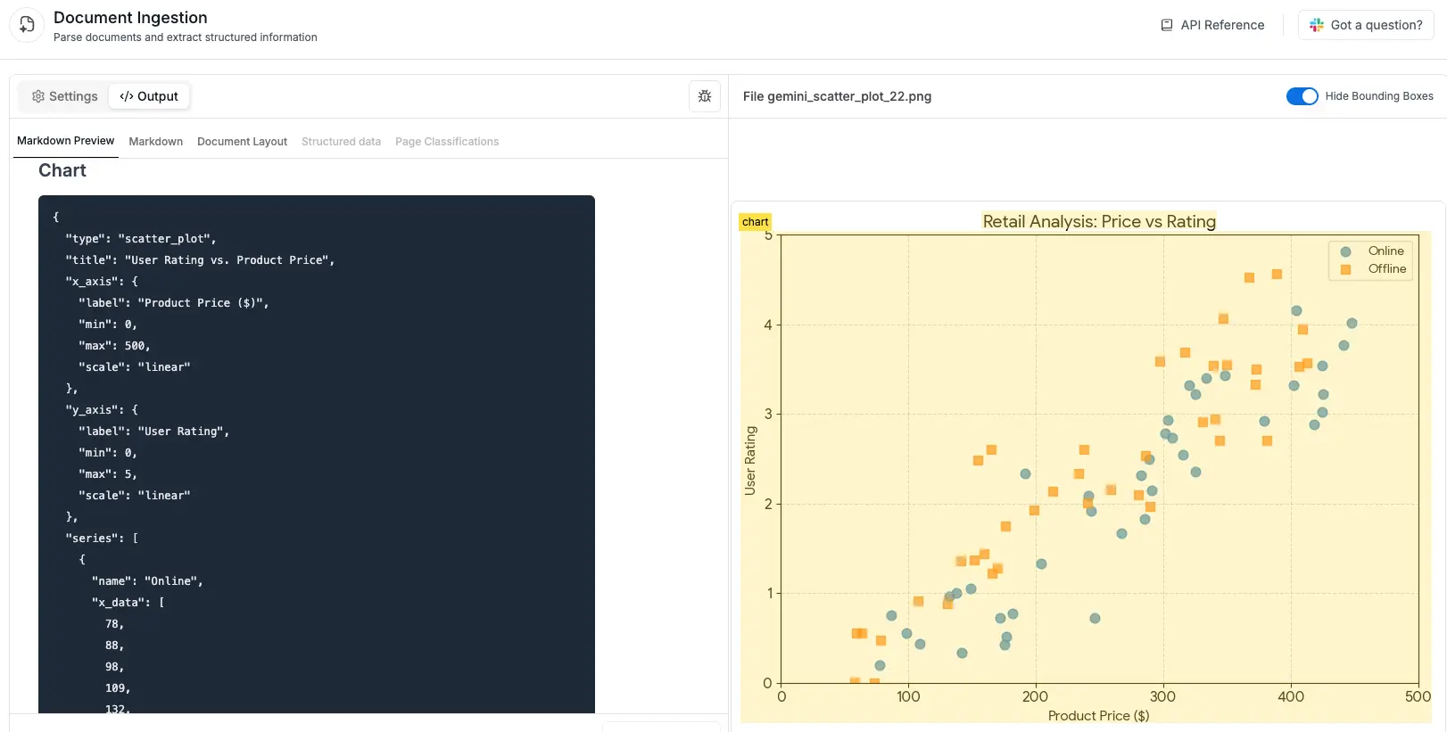
Chart extraction is currently available in all OCR models. As shown in the example below, charts are extracted and structured in a consistent JSON format.
Additional Examples
Bar Chart Example
Original
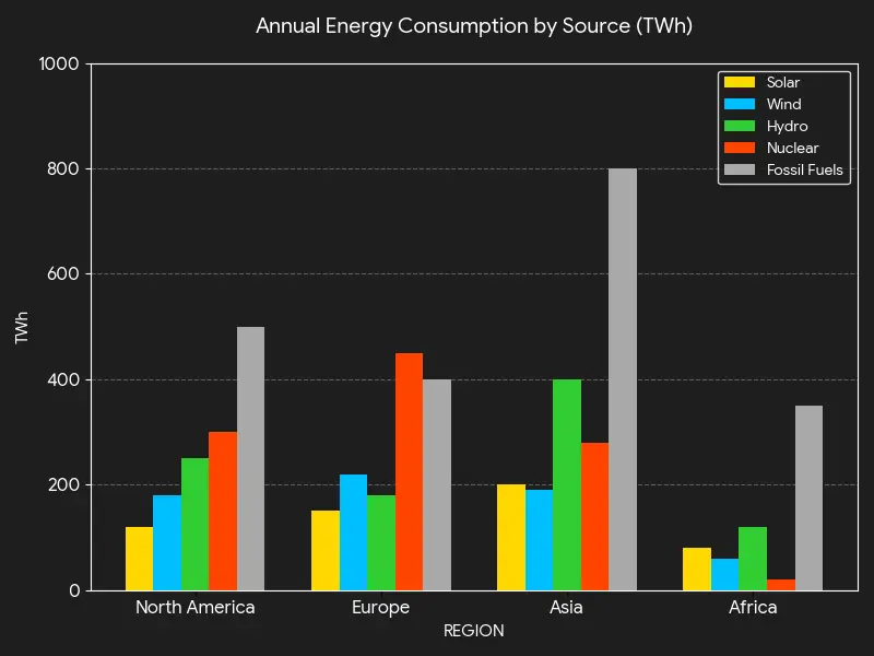
Plotted Prediction
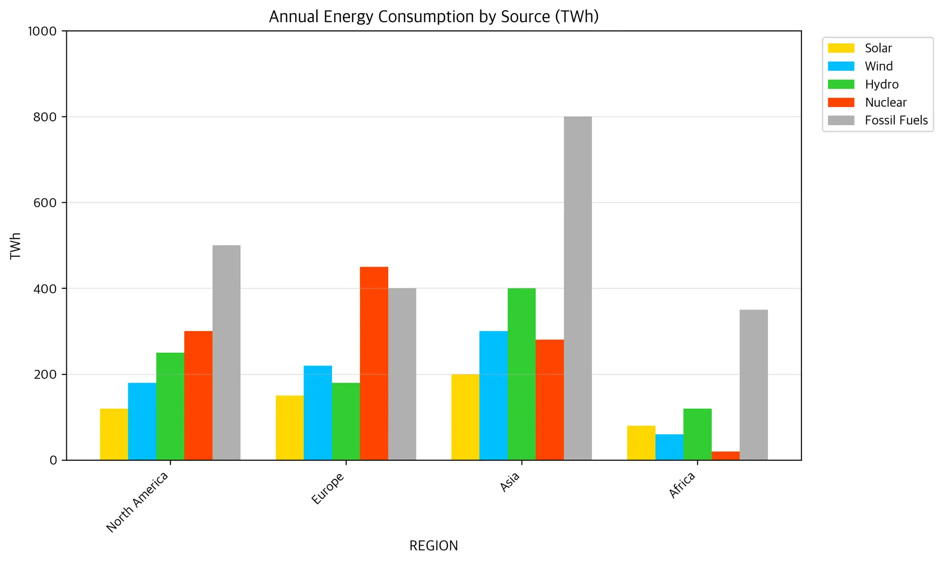
Predicted JSON
{"type": "bar_chart", "title": "Annual Energy Consumption by Source (TWh)", "orientation": "vertical", "x_axis": {"label": "REGION", "categories": ["North America", "Europe", "Asia", "Africa"]}, "y_axis": {"label": "TWh", "min": 0, "max": 1000, "format": "number"}, "series": [{"name": "Solar", "data": [120, 150, 200, 80], "color": "#FFD700", "show_values": false}, {"name": "Wind", "data": [180, 220, 300, 60], "color": "#00BFFF", "show_values": false}, {"name": "Hydro", "data": [250, 180, 400, 120], "color": "#32CD32", "show_values": false}, {"name": "Nuclear", "data": [300, 450, 280, 20], "color": "#FF4500", "show_values": false}, {"name": "Fossil Fuels", "data": [500, 400, 800, 350], "color": "#B0B0B0", "show_values": false}], "bar_style": "grouped", "grid": true}
Scatter Plot Example
Original
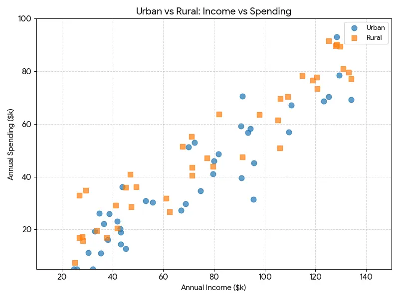
Plotted Prediction
Predicted JSON
{"type": "scatter_plot", "title": "Urban vs Rural: Income vs Spending", "x_axis": {"label": "Annual Income ($k)", "min": 10, "max": 150, "scale": "linear"}, "y_axis": {"label": "Annual Spending ($k)", "min": 0, "max": 100, "scale": "linear"}, "series": [{"name": "Urban", "x_data": [24, 32, 30, 35, 33, 36, 35, 39, 42, 43, 43, 45, 44, 53, 56, 67, 69, 70, 72, 75, 80, 80, 82, 91, 91, 91, 93, 94, 96, 96, 110, 111, 123, 125, 128, 130, 134], "y_data": [4, 4, 11, 11, 19, 22, 26, 26, 23, 19, 14, 13, 36, 31, 30, 27, 30, 52, 53, 35, 41, 46, 49, 40, 59, 71, 57, 58, 45, 32, 57, 67, 69, 71, 93, 79, 70], "color": "#5da5da", "marker": "o", "alpha": 0.75}, {"name": "Rural", "x_data": [25, 27, 28, 27, 29, 34, 38, 41, 42, 45, 47, 47, 49, 61, 63, 68, 71, 71, 71, 77, 80, 82, 91, 98, 105, 106, 106, 109, 115, 119, 121, 121, 125, 128, 129, 131, 133, 134], "y_data": [7, 17, 16, 33, 35, 19, 17, 29, 20, 36, 41, 29, 36, 32, 27, 51, 55, 41, 44, 47, 44, 63, 48, 63, 62, 51, 70, 71, 78, 77, 78, 73, 91, 90, 89, 81, 80, 78], "color": "#faa43a", "marker": "s", "alpha": 0.75}], "legend_position": "upper right", "grid": true}
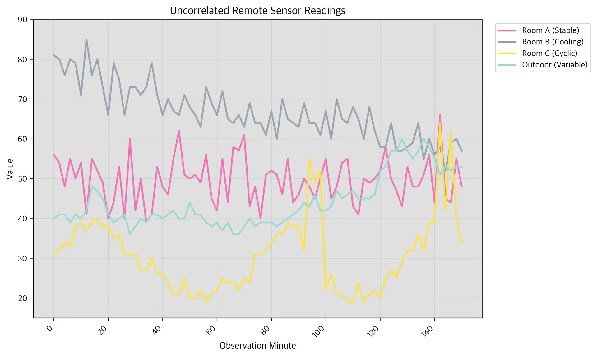
Linear Chart Example
Original
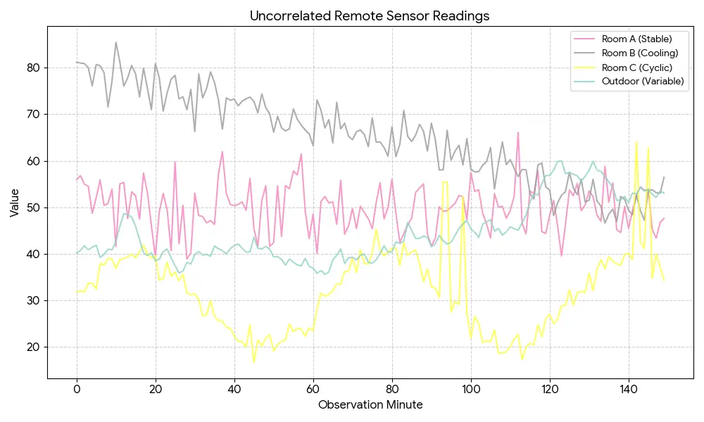
Plotted Prediction
Predicted JSON
{"type": "line_chart", "title": "Uncorrelated Remote Sensor Readings", "x_axis": {"label": "Observation Minute", "values": [0, 2, 4, 6, 8, 10, 12, 14, 16, 18, 20, 22, 24, 26, 28, 30, 32, 34, 36, 38, 40, 42, 44, 46, 48, 50, 52, 54, 56, 58, 60, 62, 64, 66, 68, 70, 72, 74, 76, 78, 80, 82, 84, 86, 88, 90, 92, 94, 96, 98, 100, 102, 104, 106, 108, 110, 112, 114, 116, 118, 120, 122, 124, 126, 128, 130, 132, 134, 136, 138, 140, 142, 144, 146, 148, 150], "scale": "linear"}, "y_axis": {"label": "Value", "min": 15, "max": 90, "scale": "linear"}, "series": [{"name": "Room A (Stable)", "data": [56, 54, 48, 55, 50, 54, 41, 55, 52, 49, 40, 44, 53, 40, 60, 42, 50, 39, 41, 53, 48, 46, 55, 62, 51, 50, 51, 49, 56, 45, 42, 55, 44, 58, 57, 61, 43, 48, 40, 51, 52, 51, 46, 55, 44, 46, 50, 48, 45, 50, 55, 45, 48, 54, 55, 43, 41, 50, 49, 50, 52, 58, 50, 47, 43, 53, 48, 48, 51, 56, 44, 66, 45, 44, 55, 48], "color": "#F472B6", "line_style": "-"}, {"name": "Room B (Cooling)", "data": [81, 80, 76, 80, 79, 71, 85, 76, 80, 73, 66, 79, 75, 66, 73, 73, 71, 73, 79, 71, 66, 70, 67, 66, 71, 68, 66, 63, 73, 69, 66, 72, 65, 64, 66, 63, 69, 64, 64, 61, 67, 60, 70, 65, 64, 63, 69, 64, 64, 61, 67, 60, 70, 65, 64, 68, 65, 60, 68, 62, 58, 58, 64, 57, 57, 58, 59, 64, 55, 60, 56, 58, 52, 59, 60, 57], "color": "#9CA3AF", "line_style": "-"}, {"name": "Room C (Cyclic)", "data": [31, 32, 34, 33, 38, 39, 37, 39, 40, 38, 38, 35, 36, 31, 31, 31, 27, 27, 30, 26, 26, 24, 21, 21, 25, 20, 20, 22, 19, 21, 22, 25, 24, 24, 22, 25, 24, 31, 31, 32, 34, 36, 36, 39, 38, 38, 32, 55, 49, 52, 22, 26, 21, 21, 19, 19, 24, 19, 21, 22, 20, 25, 27, 25, 29, 32, 32, 36, 32, 39, 39, 64, 42, 62, 40, 34], "color": "#FDE047", "line_style": "-"}, {"name": "Outdoor (Variable)", "data": [40, 41, 41, 39, 41, 40, 42, 48, 47, 45, 41, 39, 40, 41, 36, 38, 40, 39, 41, 41, 40, 41, 42, 40, 40, 44, 41, 41, 39, 38, 39, 37, 39, 36, 36, 38, 40, 38, 39, 39, 39, 38, 39, 40, 41, 42, 44, 43, 46, 42, 42, 43, 47, 45, 46, 47, 45, 45, 45, 46, 52, 53, 57, 57, 60, 57, 55, 57, 60, 58, 55, 51, 53, 52, 53, 53], "color": "#9CD9D3", "line_style": "-"}], "legend_position": "upper right", "grid": true}
SDK Usage
Install or update to the latest version of tensorlake.
1pip install --upgrade tensorlakeYou can enable chart extraction in your parse request by selecting as an enrichment option.
1from tensorlake.documentai import DocumentAI
2from tensorlake.documentai.models.options import (
3  EnrichmentOptions,
4)
5
6enrichment_options = EnrichmentOptions(
7  chart_extraction=True,
8)
9
10doc_ai = DocumentAI(api_key=API_KEY)
11
12parse_id = doc_ai.read(
13  file_id="file_XXX",  # Replace with your file ID or URL
14  enrichment_options=enrichment_options,
15)
API Usage
You can enable chart extraction in your parse request by selecting as an enrichment option.
1// POST /api/v2/parse
2{
3  "enrichment_options": {
4      "chart_extraction": true,
5  }
6}
Related articles

Get server-less runtime for agents and data ingestion

Tensorlake is the Agentic Compute Runtime the durable serverless platform that runs Agents at scale.
“With Tensorlake, we've been able to handle complex document parsing and data formats that many other providers don't support natively, at a throughput that significantly improves our application's UX. Beyond the technology, the team's responsiveness stands out, they quickly iterate on our feedback and continuously expand the model's capabilities.”
"At SIXT, we're building AI-powered experiences for millions of customers while managing the complexity of enterprise-scale data. TensorLake gives us the foundation we need—reliable document ingestion that runs securely in our VPC to power our generative AI initiatives."
“Tensorlake enabled us to avoid building and operating an in-house OCR pipeline by providing a robust, scalable OCR and document ingestion layer with excellent accuracy and feature coverage. Ongoing improvements to the platform, combined with strong technical support, make it a dependable foundation for our scientific document workflows.”
"For BindHQ customers, the integration with Tensorlake represents a shift from manual data handling to intelligent automation, helping insurance businesses operate with greater precision, and responsiveness across a variety of transactions"
“Tensorlake let us ship faster and stay reliable from day one. Complex stateful AI workloads that used to require serious infra engineering are now just long-running functions. As we scale, that means we can stay lean—building product, not managing infrastructure.”
